“An image is worth a thousand words”
It’s a saying we’ve all heard before and from the content on our newsfeed, it’s easy to see how it’s true. As we scroll, we are bombarded with images with little to no text on them.
In the evolution of the most popular social media platforms, we’ve gone from Facebook, where written posts were all the jam, to Instagram, where pictures are not only the focal point of the platform but their aesthetic quality is expected to be excellent. Autoplay features on these platforms have made videos ubiquitous and vital, and in fact, we see younger crowds move to TikTok, a platform entirely based on video content. But what are videos if not a series of images? The visual is at the center of our online world and it is based on this observation that we seek to investigate what an image search can tell us about crowdlending.
Ok Google, what do you see?
Our methodology is not very different from what anybody’s might be when looking up crowdlending: we opened Google and searched for “crowdlending” in its images (with the help of python). We downloaded the first 300 images* and then things got more interesting, form the data science perspective.
*A quick note: we executed this command on February 21st, 2020, and on the computer of Cédric, our data science intern. By now, some of the resulting images from the same query might be different. In the next Figure, we display all the gathered images.

We could have asked visual experts and designers to do some analysis for us, but as we wanted to use machine learning techniques on alternative data, images, we asked the Google Cloud Vision API.
The first step for the API was to identify the components of our images, performing object detection on each image of the sample, and ranking the detected objects from most to least occurring. The API allowed us to gather the three main “annotations” identified in the images for each of the 300 images (900 annotations in total). The next Figure shows the occurrence of the 14 most appearing annotations.
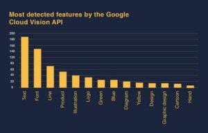
The three most identified annotations are: text, font, and line. The “text” annotation tells us that there is text in the image, the “font” annotation tells us that a clear font is identified in the image, and the “line” annotation tells us that an important portion of the image is either a graph, a figure, or a diagram.
Here, we present the same output but this time in terms of percentage.
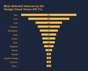
We set out to do image analysis and yet, 32% of our images contain text… Disappointed or not, this still tells us a lot about the way crowdlending is seen online: crowdlending images are created to be descriptive illustrations.
And Google agrees with us: 7% of the images are identified as illustrations, 2% as a design, 2% as graphic design, 4% as a diagram, and 2% as a cartoon. It is obvious that most of these images would include some text, which explains the high occurrence of text, font, and lines in our annotations.
Interestingly, 5% of the images are logos of crowdlending companies.
Text, but what else?
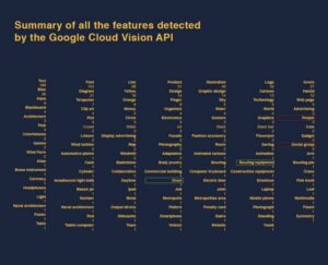
As we might expect, the “crowd” in “crowdlending” gets represented visually, “people” and “social group” (red frames) are on the list of annotations. We also find “drum” and “bowling equipment” (green frames), which are not the first things that come to mind when thinking of crowdlending.
An annotation that is interesting for its absence, is “human face”. In our image collection there aren’t any specific individuals, only groups of them. This is very different from images from the banking industry. Banks often portray single human faces to represent a counselor, to showcase the tailored services provided, or to introduce a top manager of the firm. For P2P platforms the accent is more on the collective power of the group or the crowd and consequently, not a single individual human face has been detected among the sample.
Let’s look beyond annotations
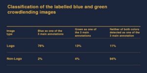
When discarding the various shades of grey and brown that dominate most photographs, the Google API tells us that most dominant colors in our images are green (5% of the time) and blue (4% of the time). These percentages may not seem very high, but they are nonetheless informative.
Green is a color that is considered stabilizing in graphic design, and in most western cultures it is associated with representing growth, calm, and abundance. In a more ad-hoc analysis, we can see that the crowdlending images are using green to highlight the growth of the P2P market and to emphasize its stability.
Similarly, the color blue is associated with responsibility, strength, and reliability. Unsurprisingly, it is mainly detected within the logo images, which suggests that crowdlending companies are using it to express their reliability toward potential investors or borrowers.
Blue and green are very common online (think of the Facebook platform), but even more so in the external communication images provided by banks and other financial institutions. Whether it’s a traditional banking company or a newly born crowdlending platform, both exercise within the financial sector where reliability and trust are the main drivers of any transaction.
But let’s look deeper
We did some of our own analysis by generalizing each image down to its most dominant color. The result is a unique mix of primary colors, namely red, green, and blue. The outputs can be seen in the radar graphs in the next Figure. For each collected dominant color we then extracted the amount of red, green, and blue and summed them up. We also used the same approach but this time we added each distinct color value multiplied by its weight or proportion within the image.
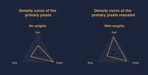
Looking at the first radar graph, several observations can be made. It supports the Google Cloud Vision API’s detections: green was previously detected as the most occurring in crowdlending images, followed by blue, and then red. Based on solely pixel values we obtain the same order.
However on the second radar chart, when the weight within the proper image is taken into account the red pixels are taking the lead, followed by the green, and lastly by blue. Since the only thing that has changed is the consideration of the weight within the image they have to be the reason why, according to this analysis, red is the most occurring color. In fact, the value of the red pixels doesn’t change, so to be in front of both green and blue, the red pixels must be associated with high weights within the image. This means that when red pixels are dominating, they are not sharing the image with many other colors; while even when green and blue pixels are dominating, the image contains many other colors.
This may be explained by design guidelines: red is generally seen as such an overpowering color that it is combined only with white or grey backgrounds.
On the bright side…
Let’s take a step back and look more generally at the images, are they light or dark?
To conduct a light/dark analysis, we once again reduced each image down to its dominant color. Then for each primary color, we determined whether it was on the bright or dark spectrum.
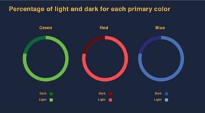
From the Figure above, we can observe that the vast majority of the dominant colors are composed of light primary colors. Based on these outputs we infer that the majority of the crowdlending images have a light dominant color. We can assume that the average crowdlending image is mainly light.
This insight furthers the positive vibe that green and blue instill in the images. Light tones are associated with day time and transparency, furthering the message that crowdlending is a positive and trustworthy activity.
Final Crowdlending’s composite drawing:
Our analysis has given us a pretty clear idea of what the average crowdlending image looks like. It is informative and generally includes text and a figure, sometimes a group of people. It inspires positivity and reliability by using a mix of colors where green and blue are dominant. It is often accompanied by a logo and bowling equipment… wait, what?
Here is our attempt to best fit the description:
*A Special thanks goes to Cedric Higel, our data scientist intern who played an important role in producing and writing this article. The same goes for Benedetta Pusateri, who did a great job on the editing side.